
Abstract
As the basis of app design, User Interface User Experience (UI/UX) is aimed to make platforms appealing to users. The UI/UX design of a social media app plays a significant role in attracting and retaining users, and even influencing their behavior. For this reason, much of UI/UX is based on psychological principles, such as Gestalt Principles in visual design and gamification techniques in app experience. The design of the app interface is often deliberately created to encourage users to spend more time on the app, and ultimately, spend money.
Key Words: UIUX, graphic design, social media, psychology, Instagram
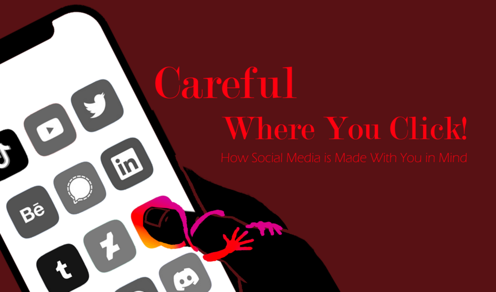
Social Media is Manipulating You.
Well, sort of. User Interface/User Experience (UI/UX) uses principles of design and human behavior to enhance user interaction and experience. These apps are built to influence your decisions based on how they predict you’ll behave: namely getting you to spend time on the app and money on your card.
What even is UI/UX?
UI/UX involves making an interface visually pleasing, simple to navigate, and—especially when it comes to mobile device apps—physically easy to interact with. This means graphic design, psychology, and even physiology come into play to bring you an app you’ll actually want to be on. The first part of the interface most users will experience is seeing it, so the psychology of visual information is immediately relevant to UI/UX. Many key design principles are based on the Gestalt Principles: a series of theories from German psychologists in the 1920’s that describe how we group visual information into meaningful categories[1].
The Gestalt Principles

Figure 1. The six most common principles associated with Gestalt [2].
Starting at the top left, the Law of Similarity principle suggests that objects of similar shape, color, or size tend to be perceived as a group. In Figure 1, the circles in the example are identical aside from their color, but the red circles and blue circles clearly appear as separate groups. The Law of Good Figure is more subjective, but it states that people will break down a complex shape into its simplest form: we prefer simple, symmetrical, and intuitive order. You likely see the shape in Figure 1 as five overlapping rings, but there aren’t any border definitions or shading to imply that these are separate circles rather than an ambiguous line. Our brains just believe that this result is the most reasonable. Next, the Law of Proximity states that objects that are closer to each other are perceived as belonging together, and gaps are perceived as divisions between groups. Back in Figure 1, we see this effect with identical circles again, yet, there appears to be a group of circles on the left and a group on the right. The Law of Continuity proposes that we tend to perceive objects in a continuous flow even with interruptions in their path; the circles in Figure 1 seem to follow a singular line despite them not being connected. If you look closely, the circles aren’t identical in size either, but we still group them together. Then we have the Law of Closure: people will perceive complete shapes from incomplete elements to create meaningful wholes. The diamond shape in Figure 1 can easily be seen despite the lines being disrupted because the brain intuitively finishes the lines to complete the shape. The final principle, the Law of Common Region, suggests that objects within the same boundary will be understood as grouped together. In the Figure, the red circles are intuitively grouped by the encompassing blue circles. Even though the two red circles in the center are closer to each other, the boundary defines them as separately grouped.
Gestalt Principles in Graphic Design
These principles form many of the key fundamentals of app design. For example, in Figure 2 below, we see the influence of similarity in hierarchy: the shapes are of different sizes, and this dissimilarity separates them. Proximity is a direct correlation. Layouts typically include boundaries (common regions) or continuity to create an intuitive app base.
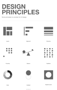
Figure 2. Key design principles [3].
We won’t get into every design principle; different designers might not even include the same principles as key, but we can see the deliberation that goes into app design regardless. Humans have predictable behaviors and designers take these into account for nearly every minute detail. Take Instagram for example in Figure 3.

Figure 3. Example of an Instagram Home [4].
The little icons at the bottom are grouped in a common region and are of similar size, creating an intuitive notion of the tab. Notice that only one of the icons is filled. If you’ve used Instagram, you’ll know that the icons are for different pages on the app; the dissimilarity in color easily informs the user which page they are currently on. A survey conducted found that 93.6% of users answered that these icons are easy to understand and use [5]. In the menu at the top right of the feed, we see a common region formed by a boundary grouping “Following” and “Favorites” with their respective icons despite the words being closer to each other than to the icons. These are a few quick analyses of Gestalt in graphic design, but we’re nowhere near the end of psychology in UI/UX.
The Psychology of Staying
Apps are products and the more users use them, the more money that product makes. It’s not enough to just get you on the app, they need to make you stay on for as long as possible. This is where the UX comes in. News feeds, notifications, and messaging systems are a few of the methods that apps can use to increase engagement. Social media apps often use gamification techniques—the use of gaming mechanics like reward systems in non-game interfaces—to encourage users to stay engaged with their platform [6]. These techniques are carefully designed to make users feel a sense of accomplishment and keep them coming back for more. Snapchat streaks are a clear example of this: a number counting the consecutive days you’ve stayed in contact with someone will appear next to their contact. Instagram also has a subtle gamification technique: follower count. If you think about it, a public display of how many followers someone has doesn’t serve much of a purpose except making a competition. Having a high follower count or high number of likes on a post produces a short-term dopamine spike similar to food or sex [7]. And if you want to win this little competition, the more active you are on Instagram, the more followers and likes you will likely get. Now that your phone addiction is well underway, let’s find out how Instagram turns your embarrassingly high screentime into their paycheck.
Time is Money, but Money is Money Too
Social media apps generate revenue through a variety of means such as advertising, sponsored content, and in-app purchases. UI/UX is crucial for a seamless incorporation of these money-makers, like ads between Snapchat stories or sponsored posts that appear in your Instagram feed. Both methods gain the views of users without substantially interfering with their experience, so users aren’t likely to leave the app due to these minor interruptions. Social media apps utilize a slyer strategy in UI/UX to make spending money a little too easy. Let’s bring Figure 3 back.
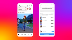
Figure 3. Example of an Instagram Home [4].
We discussed the bottom tab earlier, but let’s dive deeper. The second icon from the right is a shopping page, and from a UI/UX perspective, this positioning is crucial. 80-90% of the population is right-handed, and assuming most people hold their phone with one dominant hand, this makes the bottom right corner of the screen the easiest place for the thumb to reach [8]. Furthermore, the shopping page replaced the former notifications page. Since the notifications page is frequently used, users already have the muscle-memory of clicking the icon in that location [9]. The methods discussed earlier that encourage users to use Instagram frequently now double down to lead users to the shopping page, where there is immediately content to consume visually and commercially, as we can see in Figure 4 below.
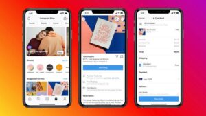
Figure 4: Instagram shopping page and example purchase [10].
The squared layout is extraordinarily similar to the home page, making the transition of socializing to spending, as smooth as possible. The app’s interface is also designed to make the purchasing process as easy as possible, with just a few clicks required to complete the transaction. Instagram isn’t the only social media to use UI/UX to influence user spending. Snapchat has a slide up feature under stories to let people comment on their friend’s posts, but the very same motion on an ad leads to the ad’s website. TikTok—the newest big social media platform—also slips linked ads into user feeds.
Careful Where You Click
We established that apps are products, so while it may be sly, it’s not malicious to try and make their users spend money. Nonetheless, social media is widely used by a young population—over 70% of Instagram users are under 35 years old [11]. Younger user groups are more likely to make impulse decisions, fall into trendy purchasing, and are less likely to have developed financial literacy [12]. Social media companies know their user base is young, and they weaponize UI/UX to target impulsivity. Understanding how social media apps are designed to make you spend money can help buffer these impulses and maybe even save a parent’s credit card bill. But this isn’t an attack on UI/UX! It really is a field dedicated to helping us enjoy the technology we use every day, and it’s only becoming more relevant as technology continues to get more interactive. Virtual reality games, 3D interfaces (think holograms), and your favorite Zero-UI robots like Siri and Alexa are the creations of brilliant UI/UX designers—all three being rapidly expanding fields. We all know that the future of technology is massive, and UI/UX will be the bridge that connects us to it.
Resources
[1] B. Wong, “Gestalt principles (Part 1),” Nature Methods, vol. 7, no. 11, p. 863, Nov. 2010.
[2] K. Cherry, Verywell / JR Bee. 2023.
[3] J. White, Design Principles. 2017.
[4] S. Perez, Example Screenshot of an iPhone Instagram Home . 2023.
[5] A. D. Subarna and A. S. Arianti, “Analysis on User Interfaces Readability: A Case Study of Instagram,” IOP Science, 2020. [Online]. Available: https://iopscience-iop-org.libproxy2.usc.edu/article/10.1088/1757-899X/879/1/012118. [Accessed: 27-Feb-2023].
[6] C. Dichev and D. Dicheva, “Gamifying education: what is known, what is believed and what remains uncertain: a critical review: Revista de Universidad y Sociedad del Conocimiento,” International Journal of Educational Technology in Higher Education, vol. 14, pp. 1-36, 2017. Available: http://libproxy.usc.edu/login?url=https://www.proquest.com/scholarly-journals/gamifying-education-what-is-known-believed/docview/2147563360/se-2. DOI: https://doi.org/10.1186/s41239-017-0042-5. [Accessed: 29-Mar-2023].
[7] S. Bhatt, The Attention Deficit: Unintended Consequences of Digital Connectivity. Cham: Springer International Publishing, 2019. doi: 10.1007/978-3-030-21848-5.
[8] “Is handedness determined by genetics?: Medlineplus Genetics,” MedlinePlus. [Online]. Available: https://medlineplus.gov/genetics/understanding/traits/handedness/#:~:text=Although%20the%20percentage%20varies%20worldwide,with%20either%20hand)%20are%20uncommon. [Accessed: 03-Apr-2023].
[9] S. Perez, “Instagram is removing the shop tab, moving reels from the center spot in Design Overhaul Next month,” TechCrunch, 09-Jan-2023. [Online]. Available: https://techcrunch.com/2023/01/09/instagram-is-removing-the-shop-tab-moving-reels-from-the-center-spot-in-design-overhaul-next-month/. [Accessed: 26-Feb-2023].
[10] M. Southern, Instagram shopping page and example purchase. 2023.
[11] M. Iqbal, “Instagram revenue and Usage Statistics (2023),” Business of Apps, 28-Apr-2023. [Online]. Available: https://www.businessofapps.com/data/instagram-statistics/. [Accessed: 25-Apr-2023].
[12] Terhi-Anna Wilska, “Mobile phone use as part of young people’s consumption styles: Journal of Consumer Policy,” Journal of Consumer Policy, vol. 26, (4), pp. 441-463, 2003. Available: http://libproxy.usc.edu/login?url=https://www.proquest.com/scholarly-journals/mobile-phone-use-as-part-young-peoples/docview/198348334/se-2. DOI: https://doi.org/10.1023/A:1026331016172. [Accessed: 01-Apr-2023].